Posts

Wizard of Oz Poster

Image
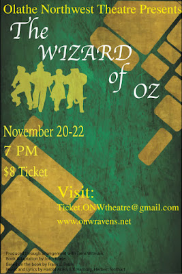
Contrast The Contrast I used in this poster is the Yellow on the green background and I used different colors all around. At first, I used blue in some places, but I ruled that as too hard to see. At first, I thought the yellow wouldn't show on the yellow road, but it seems to look good and pop out. Then I just used different fonts to show contrast in between the groups I made. Alignment I tried to align things like the title, the picture, the date, time, cost, our school, and fine print on the right. I aligned the visit on the right to add more contrast. But thats really all I did for the alignment aspect of carp. Repetition One way I used repetition is using yellow. With the yellow brick road, the words I used that had yellow, and the picture, I used a lot of repetition with the color yellow. Another way I used repetition is the way I used left alignment throughout the whole poster. I used left alignment for everything except the visit paragraph on the right. T...
Typography

Image
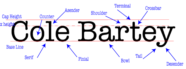
Project What we had to do in this project is first chose a font that had some sort of a serif in it. The after that we typed out our name really big and put 3 horizontal lines, one representing cap height, one representing base line, and one representing the top of the lower case letters, or x height. Then we deciphered a lot of parts that make a type face and labeled them in our name, and put arrows pointing to them. We had to have 10 of those, and after that, you were done What I Learned What I learned from this project is what makes typefaces different and which one to use. Like it really matters what typeface you use in certain situations, and people overlook it all the time. It really annoys people who you use the wrong theme to the wrong situation. I also learned about the parts of letters in fonts, and that will be useful when deciding what typeface to use.

Color Wheel

Image
What I learned I made a color wheel on Adobe Illustrator. I think I made it look good. Some of the stuff I learned about adobe is how to make different shapes and rotate them. I learned how to color in shapes and how to rotate them around. I now can copy and paste using option and drag. The last thing I learned is how to make a dashed line. Design I used circles as the primary colors, the squares as secondary colors, and the triangles as tertiary colors. Then I used the dashed line connecting the secondary color and the solid line connects the primary colors.The circle connects all the colors. Take Aways What Im going to take away from this is the basics of adobe illustrator. I need to know these things for bigger projects we will do later. This is a good starting project and I know I can improve. These basics go a long way in big projects.

Logo Color Schemes

Image
Logo Color Schemes Analogous This logo uses the analogous colors of green, yellow-green, and yellow. I think the company probably chose these colors because it makes a nice, cool transition from green all the way down to white. This logo uses the analogous colors of yellow and yellow-green. I think the company probably chose these colors because it gives off a sort of "fresh" and "healthy" look to it. Complementary This logo uses the complementary colors of violet and yellow. I think the company probably chose these colors because vikings are usually imagined with flowing, blood hair and to contrast that, they used violet. This logo uses the complementary colors of orange and blue. I think the company chose these colors because orange is the flavor of their soda, so to contrast the orange, they chose blue. Warm This logo uses the warm colors of red and yellow. I think the company chose these colors because they...

Final Blogger

Image
Overview What we had to do is make a website about our e-comm experiences and an overview of what we did.  Some of the things I had to do to make my website work is embedding YouTube videos, making links, copying and pasting our old bloggers from earlier projects, putting in different colors, making specific headers, etc. What Did I Learn? Some specific things I learned about Dreamweaver is basically the general things about it. Some of the generic things were coding, embedding, linking, etc. These are the basic things I need to know about web design before I move to more intricate stuff. How Well Did I Do I had a few slip ups that I had to fix, but overall I feel I did pretty good. The part I had trouble with was the coloring and then later I had to fix more of my project because not everything was correct. The thing that I will enhance to the next project is coding and following the videos very closely so I don't miss any instructions or steps. General Thoughts and C...

Chase Scene Blogger

Image
The ideas we came up with were pretty smooth. I think as a group our ideas were creative, including the story line, the chase part, and the ending. All together the places we looked at we all agreed on. A problem we ran into was we were going to shoot a scene in the courtyard, but that door was locked so we had to work around it. All together the filming process and role choosing was pretty smooth. Our group thought it would be funny if me and Ethan were the actors, so we just went with it. I was the actor and I wish I had more emotions of my face. I feel overall I have became more of a creative editor. My first video really didn't have anything special to it. But this time I added the heart beat and that one little thing makes this project that much better. I can keep on improving by just getting more creative. Our team as a whole worked really well together. We all threw out ideas and reflected on them. We did not fight and acted efficiently.

Point A To Point B Blog Post

Image
              We still used our six shots in this video, so it really helped to do the how to print a document project before this because we still did these techniques. My group was Samantha and Tyler. Me and our group tried to use all the shots, so I feel we worked pretty well together. The editing process wasn't much different than our first project. I cut down all the videos into a reasonable time length, and put in music. We made our story about me trying to get to class, and we mostly filmed corner turns. We felt like we couldn't fit all the straights in our video. All in all, me and my group did work well together. We all threw out ideas and took all ideas in conserderation. What I would do differently they to make it less cheesy. My video is really cheesy.