Posts

CSS and CARP Design

Image
So the overview of this project is we started out with a poem that didn't have any CARP in it, then we followed steps to change it into A poem with really good CARP. The only difference between the start and the finish is we used CARP to make it look better. All the content stayed the same. The C in CARP stands for contrast. we used Contrast by spacing them out well, using bold and Italics in the first paragraph and author name, and made the heading and sub heading bigger. These all helped the reader understand what needs to go with each other. The A in CARP is alignment. We made all the poem left align except for the subheading which was center align. So that makes the whole website fit and easy to read. The R in CARP is repetition. We used repetition mostly in the colors because all of the colors on this page matches the color of the dog. We did that on purpose and we did that by using the eyedrops tool,  hovering over the dog, and clicking what col...
My Personality

Image
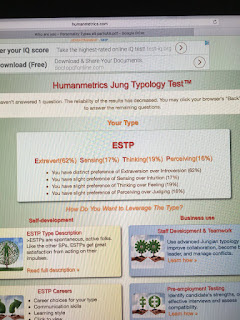
ESTP When I took the quiz, I got ESTP, and when reading about it, that does kind of sound like me. But some of the famous people that had the same characteristics as me, didn't sound like me. For example, Donald Trump and Andrew Jackson had the same personality traits as me, and I feel our personalities are completely different. But I feel the test is pretty accurate and here are a few reasons why. This personality does fit me. For example, it says flexible and tolerant. I am always down for any change or any idea different. I don't like to follow a plan that you have to be right on track. You should be flexible and change the plan on the way. The way this helps me understand who I am is by every group project, I need to listen to others ideas and down for any change to our project. Unless if I have a really good idea, I shouldn't be leading the team and taking charge. I don't want to say I'm the log of the group, but I'm not the leader. I...

My Own Logo

Image
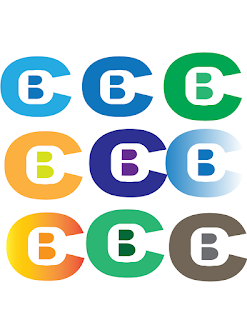
Starting Up The whole sketch thing before making the logo was the hardest thing in my opinion. It was difficult coming up with a logo that was simple and looked clean. I got to two final ideas, and remodeled one to look better and chose that one. Then when I got on the computer I didn't really know how I would make my design look good on the computer. When I first just used a normal C and a normal B, I didn't like the way the B looked in my logo. I wanted to make the back part of my B more straight so it looked more like a B. Next, I tried Distorting it, and it captured the idea I wanted, but it just didn't look good. A lot of those attempts mad the C not good and the B line still wasn't fully straight. But I knew I was getting somewhere. Then I made a white square with rounded edges, and that looked, perfect. I shaped the square to make it look better and that was the base of my logo. Choosing Color/Mock Ups After I made the ba...

Wizard of Oz Poster

Image
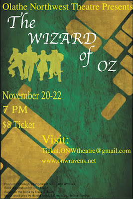
Contrast The Contrast I used in this poster is the Yellow on the green background and I used different colors all around. At first, I used blue in some places, but I ruled that as too hard to see. At first, I thought the yellow wouldn't show on the yellow road, but it seems to look good and pop out. Then I just used different fonts to show contrast in between the groups I made. Alignment I tried to align things like the title, the picture, the date, time, cost, our school, and fine print on the right. I aligned the visit on the right to add more contrast. But thats really all I did for the alignment aspect of carp. Repetition One way I used repetition is using yellow. With the yellow brick road, the words I used that had yellow, and the picture, I used a lot of repetition with the color yellow. Another way I used repetition is the way I used left alignment throughout the whole poster. I used left alignment for everything except the visit paragraph on the right. T...

Typography

Image
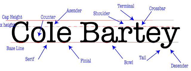
Project What we had to do in this project is first chose a font that had some sort of a serif in it. The after that we typed out our name really big and put 3 horizontal lines, one representing cap height, one representing base line, and one representing the top of the lower case letters, or x height. Then we deciphered a lot of parts that make a type face and labeled them in our name, and put arrows pointing to them. We had to have 10 of those, and after that, you were done What I Learned What I learned from this project is what makes typefaces different and which one to use. Like it really matters what typeface you use in certain situations, and people overlook it all the time. It really annoys people who you use the wrong theme to the wrong situation. I also learned about the parts of letters in fonts, and that will be useful when deciding what typeface to use.

Color Wheel

Image
What I learned I made a color wheel on Adobe Illustrator. I think I made it look good. Some of the stuff I learned about adobe is how to make different shapes and rotate them. I learned how to color in shapes and how to rotate them around. I now can copy and paste using option and drag. The last thing I learned is how to make a dashed line. Design I used circles as the primary colors, the squares as secondary colors, and the triangles as tertiary colors. Then I used the dashed line connecting the secondary color and the solid line connects the primary colors.The circle connects all the colors. Take Aways What Im going to take away from this is the basics of adobe illustrator. I need to know these things for bigger projects we will do later. This is a good starting project and I know I can improve. These basics go a long way in big projects.

Logo Color Schemes

Image
Logo Color Schemes Analogous This logo uses the analogous colors of green, yellow-green, and yellow. I think the company probably chose these colors because it makes a nice, cool transition from green all the way down to white. This logo uses the analogous colors of yellow and yellow-green. I think the company probably chose these colors because it gives off a sort of "fresh" and "healthy" look to it. Complementary This logo uses the complementary colors of violet and yellow. I think the company probably chose these colors because vikings are usually imagined with flowing, blood hair and to contrast that, they used violet. This logo uses the complementary colors of orange and blue. I think the company chose these colors because orange is the flavor of their soda, so to contrast the orange, they chose blue. Warm This logo uses the warm colors of red and yellow. I think the company chose these colors because they...