Wizard of Oz Poster
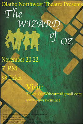
Contrast The Contrast I used in this poster is the Yellow on the green background and I used different colors all around. At first, I used blue in some places, but I ruled that as too hard to see. At first, I thought the yellow wouldn't show on the yellow road, but it seems to look good and pop out. Then I just used different fonts to show contrast in between the groups I made. Alignment I tried to align things like the title, the picture, the date, time, cost, our school, and fine print on the right. I aligned the visit on the right to add more contrast. But thats really all I did for the alignment aspect of carp. Repetition One way I used repetition is using yellow. With the yellow brick road, the words I used that had yellow, and the picture, I used a lot of repetition with the color yellow. Another way I used repetition is the way I used left alignment throughout the whole poster. I used left alignment for everything except the visit paragraph on the right. T...