Posts

Showing posts from January, 2018

Typography

Image
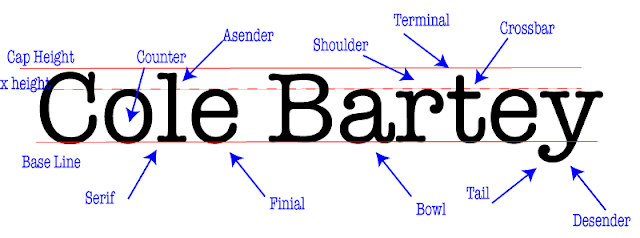
Project What we had to do in this project is first chose a font that had some sort of a serif in it. The after that we typed out our name really big and put 3 horizontal lines, one representing cap height, one representing base line, and one representing the top of the lower case letters, or x height. Then we deciphered a lot of parts that make a type face and labeled them in our name, and put arrows pointing to them. We had to have 10 of those, and after that, you were done What I Learned What I learned from this project is what makes typefaces different and which one to use. Like it really matters what typeface you use in certain situations, and people overlook it all the time. It really annoys people who you use the wrong theme to the wrong situation. I also learned about the parts of letters in fonts, and that will be useful when deciding what typeface to use.

Color Wheel

Image
What I learned I made a color wheel on Adobe Illustrator. I think I made it look good. Some of the stuff I learned about adobe is how to make different shapes and rotate them. I learned how to color in shapes and how to rotate them around. I now can copy and paste using option and drag. The last thing I learned is how to make a dashed line. Design I used circles as the primary colors, the squares as secondary colors, and the triangles as tertiary colors. Then I used the dashed line connecting the secondary color and the solid line connects the primary colors.The circle connects all the colors. Take Aways What Im going to take away from this is the basics of adobe illustrator. I need to know these things for bigger projects we will do later. This is a good starting project and I know I can improve. These basics go a long way in big projects.

Logo Color Schemes

Image
Logo Color Schemes Analogous This logo uses the analogous colors of green, yellow-green, and yellow. I think the company probably chose these colors because it makes a nice, cool transition from green all the way down to white. This logo uses the analogous colors of yellow and yellow-green. I think the company probably chose these colors because it gives off a sort of "fresh" and "healthy" look to it. Complementary This logo uses the complementary colors of violet and yellow. I think the company probably chose these colors because vikings are usually imagined with flowing, blood hair and to contrast that, they used violet. This logo uses the complementary colors of orange and blue. I think the company chose these colors because orange is the flavor of their soda, so to contrast the orange, they chose blue. Warm This logo uses the warm colors of red and yellow. I think the company chose these colors because they