Logo Color Schemes
Logo Color Schemes
Analogous
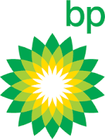
 This logo uses the analogous colors of green, yellow-green, and yellow. I think the company probably chose these colors because it makes a nice, cool transition from green all the way down to white.
This logo uses the analogous colors of yellow and yellow-green. I think the company probably chose these colors because it gives off a sort of "fresh" and "healthy" look to it.
Complementary
 This logo uses the complementary colors of violet and yellow. I think the company probably chose these colors because vikings are usually imagined with flowing, blood hair and to contrast that, they used violet.
This logo uses the complementary colors of orange and blue. I think the company chose these colors because orange is the flavor of their soda, so to contrast the orange, they chose blue.
Warm
 This logo uses the warm colors of red and yellow. I think the company chose these colors because they want to have a "warm" feel because of thinks like a warm burger and warm fries.
This logo uses the warm colors of red and yellow. I think the company chose these colors because they want you to picture you getting gas on a hot summer day.
Cool
 This logo uses the cool colors of blue and blue-green. I think the company probably chose these colors because in the animated castle intro, the whole river and everything a magical feel to it, and blue has that feeling to.
This logo has the cool colors of blue and pink. I think the company probably chose these colors because its an ice cream place so they want to make a "cold" feeling to it.
Monochromatic

This logo uses the monochromatic colors of green. I think the company chose these colors because it gives off a sort of nice and good feel to it using green.

This logo uses the monochromatic colors of blue. I think the company chose these colors because the cool colors fit well with the tech company.
 Triad
Triad
This logo uses a triad colors of green, yellow, and blue. I think the company chose these colors because it gives a sort of "fun colorful" feel to it.

This logo uses the triad colors of blue, yellow, and green. I think the company chose these colors because it also gives off a "fun colorful" feel to it.

Comments
Post a Comment