Typography Blog
Pre Production
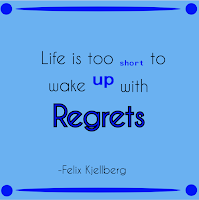
During this typography project, we had to find quotes, type them in a cool font, then made posts about the quotes. The first thing we did with this project is find quotes. I actually struggled with this because I never have been a quote guy, so this took me a little while. I found quotes by searching up people I think is inspirational and using the quotes that are applicable to my life. Then, I found a bunch of cool fonts and downloaded them. That was all for the Pre-Production.
Production
The first thing I did during the production was I chose the fonts that would work well with the theme of my quote. Then, I added some graphics by tracing photos I found online. The thing I learned the most is what type would work the best and how to line it up well. Color was more difficult than just plain black and white because you now have to keep a consistent theme with your quote, the type you chose, and the color. I would prefer color because you can add another creative perspective to your project.
Post Production
Overall, I feel I did pretty decent on the black and white, but I could have done better with the color ones. I didn't know that we were doing color after the black and white, so I would have chose quotes that had a theme represented by color. All of my quotes except for one didn't have a color theme that fit the quote, they were just random. The only one is the love quote I did. But, I was happy with my black and white quotes, and I was proud of my use of graphics in most quotes. I liked doing this project and I hope I can do something similar later.


Comments
Post a Comment