My Own Logo


Starting Up
The whole sketch thing before making the logo was the hardest thing in my opinion. It was difficult coming up with a logo that was simple and looked clean. I got to two final ideas, and remodeled one to look better and chose that one. Then when I got on the computer I didn't really know how I would make my design look good on the computer. When I first just used a normal C and a normal B, I didn't like the way the B looked in my logo. I wanted to make the back part of my B more straight so it looked more like a B. Next, I tried Distorting it, and it captured the idea I wanted, but it just didn't look good. A lot of those attempts mad the C not good and the B line still wasn't fully straight. But I knew I was getting somewhere. Then I made a white square with rounded edges, and that looked, perfect. I shaped the square to make it look better and that was the base of my logo.Choosing Color/Mock Ups
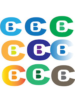
After I made the base of my logo, I was ready to choose the colors. At first I had the idea of blue, but I went the complete opposite direction and chose orange. I just started making a ton of different color combinations and asked a bunch of people which one they liked the best. Most people said either the Blue fading one of the orange fading one. I decided to go with the orange fading one because in the blue fading one it is very hard to see the end of the C while in the Orange one you can see the whole C. Then, I put it on mock ups. I liked how each one looked so I kept it. Thats all the steps I did to making my own personal logo.


Comments
Post a Comment