Pop Art blog
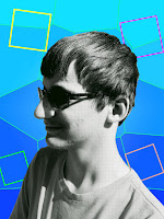
I started creating my design by changing the style with Nathan. Then I moved on to the background. I chose the filter stained glass and changed the shape size to max to get my background the way it is. Then I moved on to painting Nathans shirt red to add some more color to the project. I chose darken as the style color. Then, finally, I put random colored squares to add a little more to the background.
The color scheme I decided on was was more magenta/blue-ish. The reason I chose that was becauseI feel like they are pretty colors and show a nice blend of warm and cool colors. The colors stuck out more that I thought because I added a bunch of rocks that were gray, and the colors really popped out there.
The artist I based most of my art of was Roy Lichtenstein. The thing he does with his people is make them into tiny dots, and then he adds color. Thats what I did with Nathan. In the background, I sort of did a Warhol style, because he added random squares in some of his arts like "Ingred Bergham" or "Queen Beatrix of the Netherlands".
First, I cut out Nathan using the quick select tool, and made a new layer with just him, then put a filter that just made Nathan into grey little dots. Then I used the paint tool to paint the shirt red and darkened it. Then I make the background, changed the color to fading into a dark blue to light blue, and then added a stained glass filter and that made my background. Then I used the shape tool to make the squares in the background. The last thing I did was I mad the whole project a filter to make the whole thing a little brighter.


Comments
Post a Comment